Label design is incredibly important
20.11.2018
Label design is incredibly important. We are always available for providing advice and suggestions for your label. What else should you consider when designing a label? Here are some thoughts to help with your design process.
Label – the only interface of communication
For smaller food producers, the label is incredibly important. It is often the only interface of communication for reaching their target audience. Small-scale food producers do not have the possibility of producing their own packaging or procure expensive special packaging. In such cases, the best option is to choose neutral, generic packaging with one or more labels. They contain all information in accordance with labelling provisions, as well as all the information the producer wants to convey to the consumers. Labels are also easy to adapt in case a change of packaging is required.
Technical prerequisites
Labels can be produced in different ways:
- Fully completed at the printing house.
- Partially completed at the printing house with additional information (e.g. ingredients, best before date) printed by the food producer.
The choice is often dictated by the number of labels and how often the information requires updating. Digital printing is a cost-efficient way of handling smaller batches.
On a small budget it is advisable to avoid large colour surfaces in order to avoid higher costs. There are a variety of materials, application methods and special effects. Food packaging is often subjected to harsh conditions, including humidity and cold. The label must be able to keep its outlook for the duration of the product’s shelf life. We can help you in selecting the right materials and application methods.
The package defines the shape of the label
When determining the location and proportions of the label, it is important to consider what fits the packing and what is the intended message. A stylish, tall and slim bottle requires a label that fits its proportions. In some cases the packaging has a very aggressive appearance. This can be smoothed out with the right label. You should also evaluate how the label works when products are placed side by side. Does the label still work?
One or several labels?
Typically, the front would feature a label with more presence with the more informative label located on the back. Even though it will increase costs and require more work, the two-label approach is worth it. A visually appealing, balanced label will increase sales.
A good label design has presence from distance
A typical grocery shop has at least 25,000 products on display. No one has the time to look at each individual product, as it would take ages. The key, therefore, is capturing the attention of the shoppers. A well-designed label has something that attracts the eye already from distance, inviting the customer to have a closer look. Can different labels create a combined effect on shelf presence? Labels can indeed form a pattern that can attract customers.
Attract the right target audience and create a bond at close distance!
Getting consumers to look at your product more closely is a good way of creating attraction. This bond
can be the result of curiosity for something new and exciting, or the sense of nostalgia and familiarity. Accurately conducted target group analysis and careful design help attract consumers. Remember: you cannot please everyone. Making an attempt to be attractive to every consumer, results in a generic product. By accurately determining the target group, you are better equipped to design an attractive appearance. Pay attention to popular products in your target group and use the information, but do not go overboard with imitation. Using consumer test groups for evaluating label designs and the overall package is also beneficial.
Good layout
The first step is to put together all the elements of the label: graphics and text. The process is a bit like tidying up your desk. Tidiness in the form of a good layout is essential, as clean lines express quality and confidence. It is important to pay attention to the graphics and text. These elements should be striaight line both horizontally, and vertically. The eye is very sensitive to such patterns and may often come across as quality issues.
Conveying a feeling
The next step is to create a character and convey a feeling. This requires experience and an eye for detail. It is essential to find a balance between text, graphics and empty space. Label colours should also be correctly balanced with the colours of the product and packaging. Avoid overloading the label with elements: a cluttered look makes it difficult for consumers to find the essence. Large surfaces, vibrant colours and the right amount of empty space attract the eye.
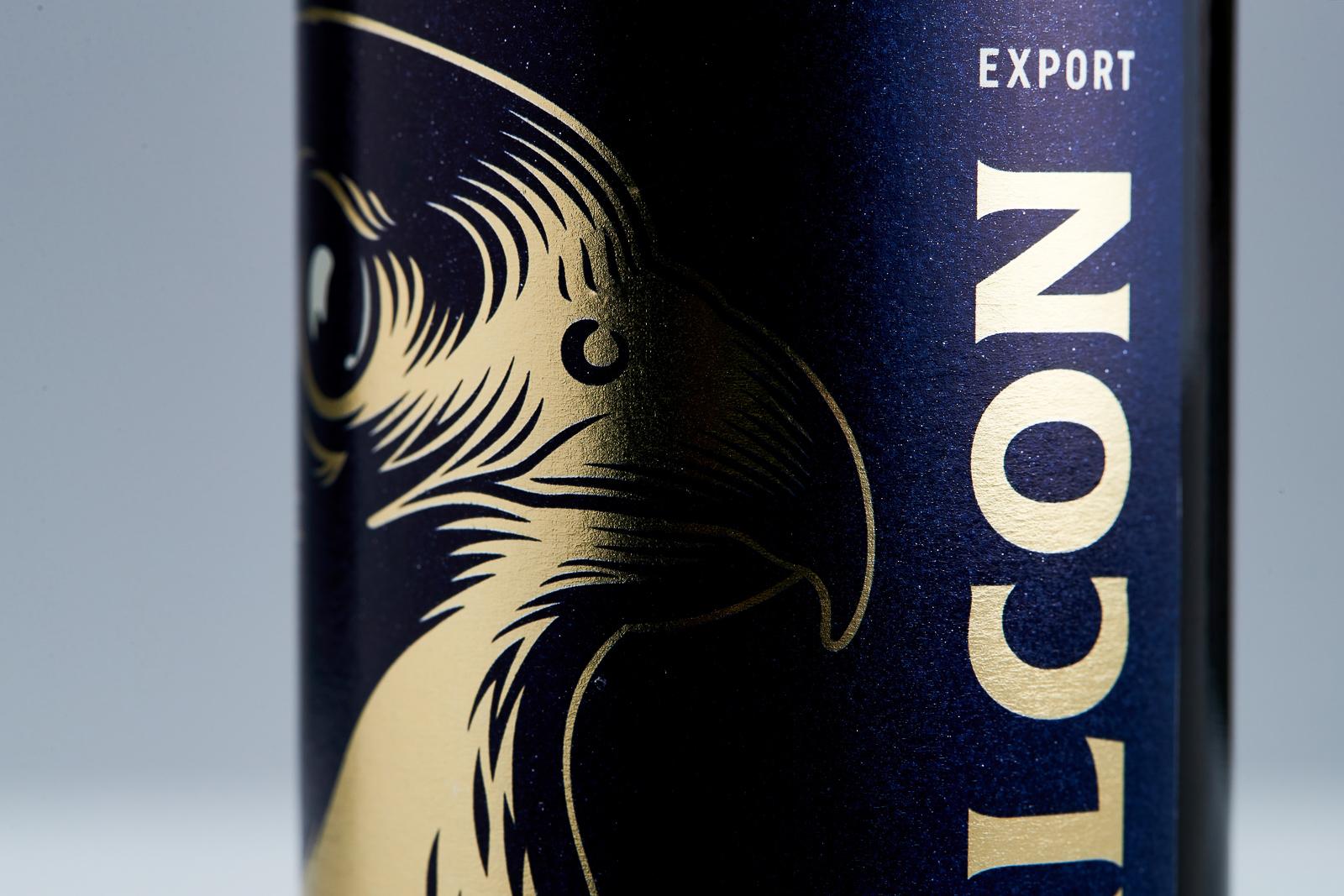
Avoid images with excessive details. Otherwise the label will be confusing. When choosing images, look at them in the exact size they will appear on the label.
Our actions are often guided by emotions. The feelings elicited by products are often the result of various factors. Small details can have a significant impact. Is it the soft paper that is nice to touch, the film-coated, durable surface? Is the background colour the right one? Is it piano white, or slightly tinted? Changing the colour from pitch black to dark grey can make a big difference. There are not right or wrong choices. It all depends on what choices the target group reacts positively to, the choices that convey real, honest emotional content. Unpacking and using the product should not be a disappointing experience.
Practicality – functionality
Think about how the label is applied. If it is done manually, it should be easy to apply in the right position. A tall, slim bottle should not have a tall, narrow label. Even the smallest misalignment would be immediately visible. Any errors like this will only be enhanced once the bottles are side by side on a shelf. While a slightly crooked label may appear charming in a vineyard outlet or a marketplace, in large grocery shops it will give off the impression of poor quality. A shoddy exterior may make the shoppers doubt the quality of the content as well. A round label is more forgiving in terms of placement. So is a wide label, the sides of which are tucked behind the bottle, or not visible when placed next to another product. If the label goes around the entire bottle, the crookedness can often be seen on misaligned edges on the back of the bottle. Typically, a visually impressive label would be applied on the front with the more informative label located on the back. This facilitates the design process, allowing the front label to be visually attractive despite all the information. The downside is that the consumer has to rotate the product to see the information, the workload is doubled and the labels cost more.
Labelling regulations that affect the design process
There are several statutory labels that should be observed. Customers must not be misled. Images should not, for example, contain more or larger fruits than in the actual products, Text should be easy to read. The statutory information often requires a fairly large printing area. It is important to reserve adequate space for such text in order to provide the consumers all statutory information in an easily legible format. Contrast with the background and the font and size should be considered as well.
Overall impression
The overall impression of the label from afar, the conveyed feeling when observed up close and target group appeal are, in the end, the deciding factors on whether a label is successful or not. Start by focusing on clarity and layout, avoid overloading and pay attention to details. It is often advisable to leave the design work to an experienced designer. It is essential to establish what you want, what preferences you have and the target group you are aiming for and find the right printing method for the labels. Know the market and your target group. The designers listen to your ideas and interpret them to a language consisting colours and patterns.
Read how a good label design boosted Hartwall’s sales.